Skizo is a small language to sketch user interfaces. You write one Element on each line. The
skizo command checks the file, shows it as a Preview page and exports it as shadcn React code.
Skizo installs from its Git repository. Each release has a Git tag, for example v0.4.0-alpha.1.
Always put the tag in the install command. Then each install gets the same release.
npm 12 and later blocks Git dependencies by default. The --allow-git=all option
allows them for this command only.
Make sure that the install is correct:
skizo --help
The install gives two commands: skizo and its short alias skz.
Pin an exact build
A release tag points to a commit on the release branch. This commit holds only the built CLI.
It has no build scripts and no dependencies. Thus the install runs no code from the package.
A tag can move to a different commit. To pin one exact build, use the commit hash instead of the tag.
Screen"Orders"subtitle="Track customer orders"actionsButton"New order"icon=plusCard"Revenue"desc="Last 30 days"Stat"$12,450"hint="+12% vs last month"trend=upTablecols="Order,Customer,Amount"rows=5
Check the file. The command shows all errors in one run, each with a hint.
skizo check orders.skz
Make the Preview. The command writes orders.html. Open this file in a browser.
skizo preview orders.skz
To see your changes while you edit, serve the Preview. The page reloads each time that you save.
Coding agents such as Claude Code, Codex and Cursor write Skizo. You look at the Preview and tell the agent
what to change.
The command skizo guide prints the Guide. The Guide holds the full language in about 1,300
tokens. An agent needs no other document.
Add these lines to the instructions for your agent, for example in AGENTS.md or
CLAUDE.md:
Before you write UI code, make a sketch in Skizo:1. Run `skizo guide` and read the Guide.2. Write the sketch in <name>.skz.3. Run `skizo check <name>.skz`. Fix all errors. Do this step again until the command shows no errors.4. Run `skizo preview <name>.skz` and give me the HTML file.
skizo check shows each error with its line, its Element type and a hint. Thus the agent can fix
all errors in one pass:
$ skizo check orders.skzorders.skz:4 Button unknown prop "varient" — did you mean variant?orders.skz:7 Badge unknown flag "secondary" — did you mean variant=secondary?orders.skz:9 Table row has 3 cells, expected 4 (cols: Order, Customer, Status, Amount)
While the agent works, keep skizo preview --watch open. The page reloads after each save that
passes check. You can correct the sketch before somebody writes the real code.
Write one Element on each line. Indent each level of nesting by two spaces. Do not use tabs.
A child can be only one level deeper than its parent. A file has one or more Screens at the top level.
Screen"Settings"Card"Profile"Input"Display name"
Labels, flags and props
A line starts with the Element type. After the type, write an optional Label, flags and props, in any order.
The Label is a quoted string. Its meaning depends on the type. For example, it is the text of a Button, the value
of a Stat and the alt text of an Image.
A flag is a lowercase word without a value. It means true. Examples are disabled,
open and icon-only.
A prop has the form key=value. Put quotes around a value with spaces:
placeholder="Jane Doe".
In a quoted value, \" is a quote and \\ is a backslash.
Only flags are bare words. Write variant=secondary. Do not write secondary
alone.
A list prop has values separated by commas: options="Open,Paid". Write \, for a
comma in a value.
Button"Save"variant=secondaryicon=checkdisabled
Text lines, table rows and comments
A line with only a string is a paragraph. It is the same as a Text. A line that starts with | is
a row of a Table or a Chart. Each row has one cell for each column. A line that starts with // is a comment. The
Preview and the export ignore comments.
// A note for the human. Skizo does not show it."A paragraph of text."Tablecols="Name,Role"| Ana Souza | Admin| Bruno Lima | Member
Slots
A slot word puts children into one part of their parent. Write the slot word on its own line. Then indent the
children below it.
actions puts the children in the header of a Screen or a Card.
footer puts the children in the footer of a Card, a Dialog or a Sheet.
Card"Invoice"actionsButton"Download"icon=downloadicon-onlyvariant=ghostText"Due on March 3"footerButton"Pay now"
Ids
All Elements accept id=name. An id is the target of opens= or to=.
Each id must be unique in the file. If a Screen has no id, Skizo makes one from its Label. For example,
Order details becomes order-details.
One content source
Give the content in one way only:
A Text has a Label or lorem=N.
A Table has | rows or rows=N.
A Chart has | rows or rows=N. It must have one of the two.
A List has items= or rows=N.
lorem=N and rows=N make placeholder content. The placeholder content is the same
each time that you run Skizo.
Icons
The icon= prop takes the name of a Lucide icon in kebab
case, for example plus, house or trash-2. If the name is not correct,
skizo check shows the nearest name.
Behavior is the effect of a click that you write in the source. Skizo has two kinds of Behavior:
opens=id on a Button shows the Dialog or Sheet with that id. The Dialog or Sheet must be on
the same Screen.
to=screen-id on a Button or a Sidebar Link shows a different Screen of the file.
All other interactions work without Behavior:
A Tab shows its panel when you click it.
A Menu or a Select opens when you click it.
A Dialog or a Sheet closes from its close button, its backdrop or the Escape key. A footer Button without
Behavior also closes it.
Form controls do not validate or send data.
Screen"Projects"id=projectsactionsButton"New project"icon=plusopens=new-projectButton"Open settings"variant=linkto=settingsDialog"New project"id=new-projectInput"Name"footerButton"Create"Screen"Settings"id=settingsButton"Back to projects"variant=outlineto=projects
The Preview shows one Screen at a time. The URL hash gives the name of the Screen. Thus the back button of
the browser works. If the file has no to=, the Preview shows all Screens, one below the other.
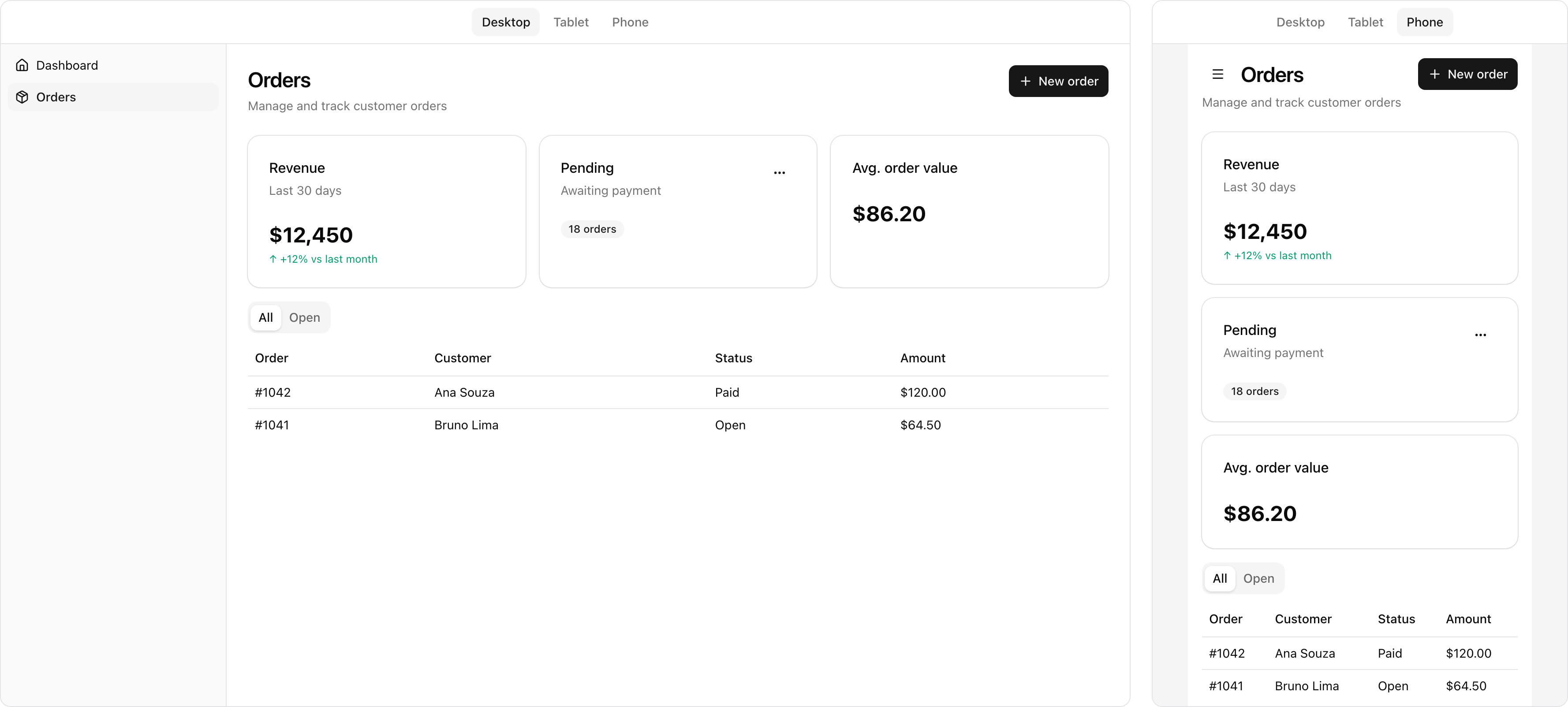
Each sketch fits phones, tablets and desktops. Write one layout, and Skizo changes it for each width. On a
phone (narrower than 768 px), a Grid shows one column. On a tablet (768 px to 1023 px), a Grid shows a maximum
of two columns. A Row puts the children that do not fit on a new line. A Table scrolls horizontally. A Screen
has less padding on a phone. On a phone, the Sidebar is hidden, and a button with the menu icon opens
it from the left. The Preview and the export use the same Tailwind classes: md: for tablets and
lg: for desktops.
This image shows the Orders example at desktop width and at phone width:
The toolbar at the top of the Preview sets the width of the sketch: Desktop (1280 px), Tablet (768 px) or
Phone (390 px). If the window is narrower than the width, the Preview makes the sketch smaller to fit the
window. To open the Preview at a width, use --viewport:
skizo preview orders.skz --viewport phone
With --watch, the page keeps the width and the Screen after each reload.
Prints the Guide. The Guide is the language reference for
agents.
skizo check <file.skz> [--json]
Shows all errors in the file, one on each
line, in the format file:line Type message. With --json, the command prints
{"errors": [{"file", "line", "type", "message"}]}.
Writes <file>.html
next to the source file. The page holds all Screens and works offline. With --watch, the command
also serves the page on 127.0.0.1 and reloads it after each save. If a save fails check, the
command shows the errors and keeps the last good page. --viewport sets the width at which the
page opens. The default is desktop.
Writes one
.tsx file for each Screen, and app-sidebar.tsx for a shared Sidebar. The files go next
to the source file, or into the --out folder. With --router, the links use the
Link component of Next.js or React Router.
skz is a short alias for skizo. preview and export do not
accept a file that fails check. They show the same errors as check.
The exit code tells the result:
0 means that the command was successful.
1 means that the file has errors.
2 means that the command is not correct, or that Skizo cannot read the file.
skizo export --target shadcn writes React code. The code imports the components of your project
from @/components/ui/*. Thus the export uses your theme and your changes to the components. Each
Screen becomes one file with the name of its id. For example, orders.tsx exports
OrdersScreen.
Requirements
A shadcn project on the Radix base. The export uses asChild.
The lucide-react package.
The shadcn components that the file uses: alert, avatar, badge, button, card, chart, checkbox, dialog,
dropdown-menu, input, label, progress, radio-group, select, separator, sheet, switch, table, tabs and
textarea.
The recharts package, if the file has a Chart. The shadcn chart component installs it.
For each Custom name, your component in @/components/<kebab-name>. For example,
ChatBubble comes from @/components/chat-bubble.
Output
opens= becomes a useState hook. A click on the Button sets the state, and the state
opens the Dialog or Sheet. The open flag sets the initial state to open.
to= becomes a plain <a href="/screen-id"> link. A Button with
to= wraps the link with asChild.
--router next writes each link as <Link href="/screen-id"> and imports
Link from next/link. A file with useState or a Chart starts with
"use client". Then the App Router runs it in the browser.
--router react-router writes each link as <Link to="/screen-id"> and imports
{ Link } from react-router.
A shared Sidebar becomes one file, app-sidebar.tsx. It exports
AppSidebar({ current }). Each Screen that shows the Sidebar renders
<AppSidebar current="screen-id" />.
An export of an unchanged file writes the same bytes. Thus a diff shows only the changes that you made in the source.
Each Element type has an example and its live Preview. The prop tables come from the schemas
that skizo check uses. In a list of values, the first value is the default. All Elements also
accept id=.
One page of the app that you sketch. A file has one or more Screens at the top level. All other Elements go in a Screen.
Screen"Orders"subtitle="Manage and track customer orders"actionsButton"Export"variant=outlineicon=downloadButton"New order"icon=plusText"The body puts its children in a column with a medium gap."
Label
Required. The page title in the header row.
Children
Any Elements
Position
The top level of the file
Slots
actions
Prop
Values
Default
Description
id
"text"
The target of to=. If you do not write it, Skizo makes it from the Label.
subtitle
"text"
A muted line below the title.
plain
flag
Shows no shared Sidebar on this Screen, for example on a sign-in Screen.
The actions slot puts Elements on the right side of the header row.
Export: A <main> element with a header row for the title, the subtitle and the actions.
The navigation column of a Screen. Write the Sidebar one time, at the top level before the first Screen. Then each Screen shows it. The Link with to= set to the current Screen shows as active.
SidebarLink"Inbox"icon=inboxto=inboxLink"Archive"icon=archiveto=archiveScreen"Inbox"id=inboxText"Click Archive in the sidebar."Screen"Archive"id=archiveText"The archive is empty."
Marks the current page. Skizo sets it from to=, so you do not usually write it. Do not write it in a shared Sidebar.
to
Screen id
Shows the Screen with this id.
A file can have one shared Sidebar.
A Screen with its own Sidebar shows its own Sidebar. Write the Sidebar as the first child of the Screen.
A Screen with the plain flag shows no Sidebar.
No Screen can have the id app-sidebar. The export uses this name for the file of the shared Sidebar.
A Link can only be in a Sidebar. For a link in the page, write Button variant=link to=....
On a phone (narrower than 768 px), the Sidebar is hidden. A button with the menu icon comes before the Screen title. The button opens the Sidebar as a Sheet from the left. A Link in the Sheet shows its Screen and closes the Sheet.
Export: A <nav> with plain <a> links, or the Link of your router with --router. The active link gets aria-current="page". The Screen puts the <nav> in an <aside> column with hidden md:flex. It also puts the <nav> in a Sheet side="left", which a md:hiddenSheetTrigger Button opens. A shared Sidebar becomes app-sidebar.tsx, which exports AppSidebar({ current }), the <nav>. Each Screen that shows it renders <AppSidebar current="screen-id" /> in the column and in the Sheet.
A Stack puts its children from top to bottom. A Row puts its children from left to right.
Stackgap=smText"A Stack puts its children from top to bottom."Rowgap=smjustify=betweenalign=centerBadge"Row"Text"A Row puts them from left to right."mutedButton"Action"size=smvariant=outline
Stack
Label
None
Children
Any Elements
Position
Anywhere in a Screen
Prop
Values
Default
Description
gap
md | sm | lg
md
The space between the children. sm, md and lg give Tailwind gap-2, gap-4 and gap-6.
align
start | center | end
start
How the children align across the Stack or Row. With start, the children stretch.
justify
start | between | end
start
How the children spread along the Stack or Row.
Row
Label
None
Children
Any Elements
Position
Anywhere in a Screen
Prop
Values
Default
Description
gap
md | sm | lg
md
The space between the children. sm, md and lg give Tailwind gap-2, gap-4 and gap-6.
align
start | center | end
start
How the children align across the Stack or Row. With start, the children stretch.
Panels that you select with tabs. The children of a Tab are its panel. In the Preview, a click on a tab shows its panel.
TabsTab"Overview"Text"The first Tab is active if no other Tab has the active flag."Tab"Activity"Listitems="Paid #1042,Refunded #1039,Paid #1038"Tab"Settings"Switch"Email alerts"checked
A paragraph. A line with only a string is also a Text.
Text"Body text. The default size is md."Text"Small and muted text for less important information."size=smmutedText"Bold text."bold"A line with only a string is a Text."Textlorem=24
Label
Optional. The text. Write a Label or lorem=, not the two.
A key number with an optional title and hint. trend sets the color of the hint and adds an arrow.
Gridcols=3Stat"$12,450"title="Revenue"hint="+12% vs last month"trend=upStat"3.4%"title="Conversion"hint="-0.3% vs last month"trend=downStat"318"title="Orders"
Label
Required. The value.
Children
None
Position
Anywhere in a Screen
Prop
Values
Default
Description
title
"text"
A small heading above the value.
hint
"text"
A small line below the value.
trend
none | up | down
none
The direction of the change. up is green and down is red.
Export: Plain markup for the title, the value and the hint. shadcn has no Stat component.
A table. Write the rows as | lines, or use rows=N to get placeholder rows.
Tablecols="Order,Customer,Status,Amount"| #1042 | Ana Souza | Paid | $120.00| #1041 | Bruno Lima | Open | $64.50Tablecols="Name,Email,Date,Status,Amount"rows=3
Label
None
Children
None
Position
Anywhere in a Screen
Prop
Values
Default
Description
cols
"a,b,c"
The column headers, separated by commas. This prop is necessary.
rows
1 or more
Shows N placeholder rows instead of | lines.
Each | row must have one cell for each column.
Skizo makes placeholder cells from the column name: Name, Email, Date, Status or Amount. Other columns get Item n. The cells are the same each time.
A line, bar, area or pie chart. Write the data as | rows, as in a Table, or use rows=N to get placeholder rows.
GridChart"Revenue"cols="Month,Revenue,Costs"| Jan | 1200 | 800| Feb | 1500 | 950| Mar | 1350 | 1100Chart"Orders"type=barcols="Day,Orders"rows=5Chart"Traffic"type=areacols="Date,Visits"rows=6Chart"Plans"type=piecols="Plan,Users"| Free | 620| Pro | 240| Team | 90
Label
Required. The accessible name of the chart. The chart does not show it.
Children
None
Position
Anywhere in a Screen
Prop
Values
Default
Description
type
line | bar | area | pie
line
The kind of chart.
cols
"a,b,c"
The column headers, separated by commas. The first column gives the x axis, or the slice names of a pie. Each other column is a series of numbers. This prop is necessary.
rows
1 or more
Shows N placeholder rows instead of | lines.
Each | row must have one cell for each column. The cells after the first cell are numbers, for example 1200 or 12.5.
A pie has exactly two columns: the slice name and its value.
A pie shows a legend with the names of its slices. Other charts show a legend when they have two or more series.
Skizo makes placeholder x values from the column name: Month, Day, Date or Year. Other columns get Item n. The numbers are the same each time.
The Preview draws the chart as an SVG image in the default shadcn chart colors. The export uses --chart-1 to --chart-5 of your theme.
Export:ChartContainer > LineChart, BarChart, AreaChart or PieChart from recharts, with ChartTooltip, and with ChartLegend when the Preview shows a legend. The data is a const array above the component, with the column slugs as keys. A ChartConfig gives the labels and colors of the series, or of the slices of a pie.
Input"Email"type=emailplaceholder="you@example.com"Input"Password"type=passwordvalue="hunter2"error="Must be at least 8 characters"Input"Search"type=searchplaceholder="Search..."disabled
A modal window. A Button with opens= shows it. The open flag shows it when the Preview loads. It must be a direct child of its Screen.
RowButton"Edit profile"opens=edit-profileDialog"Edit profile"id=edit-profiledesc="Click Save to keep your changes."openInput"Name"value="Ana Souza"footerButton"Cancel"variant=outlineButton"Save"
A component of your app that Skizo does not have, for example a chat bubble. Use it only when no other Element type fits.
Custom"ChatBubble"author="Ana Souza"sent-at="9:41"mineText"Where is my order?"Custom"TypingIndicator"
Label
Required. The name of the component, in PascalCase. For example, ChatBubble.
Children
Any Elements
Position
Anywhere in a Screen
The name cannot be the name of an Element type. For a button, write Button.
A Custom takes all props and flags. skizo check does not check them.
The Preview shows a box with a dashed border. The box shows the name, the props and the children.
Export:import { ChatBubble } from "@/components/chat-bubble" and <ChatBubble author="Ana Souza" sentAt="9:41" mine>. A prop key with a hyphen becomes camelCase. A Custom without children becomes a self-closing tag. If the file imports a different component with the same name, the export renames your component: Label as CustomLabel.
These sketches come from the examples folder. For each sketch, the page shows the
Skizo source next to its Preview. In the Preview, you can click these items:
Links and Buttons with to= show other Screens.
Buttons with opens= show Dialogs and Sheets.
Tabs, Menus and Selects open when you click them.
The other tabs above the source show the output of skizo export --target shadcn.
Each Preview opens at desktop width and is smaller to fit this page. To see the sketch at
tablet or phone width, click Tablet or Phone in the toolbar of the Preview.
The Skizo source has 34 lines and 1,144 characters. The shadcn export has
3 files, 264 lines and 11,571 characters, 10.1 times as many.
SidebarLink"Dashboard"icon=hometo=dashboardLink"Orders"icon=packageto=ordersScreen"Orders"id=orderssubtitle="Manage and track customer orders"actionsButton"New order"icon=plusopens=new-orderGridcols=3Card"Revenue"desc="Last 30 days"Stat"$12,450"hint="+12% vs last month"trend=upCard"Pending"desc="Awaiting payment"actionsMenu"Pending actions"icon=ellipsisicon-onlyvariant=ghostItem"Send reminders"Item"Cancel all"destructiveBadge"18 orders"variant=secondaryCard"Avg. order value"Stat"$86.20"TabsTab"All"activeTablecols="Order,Customer,Status,Amount"| #1042 | Ana Souza | Paid | $120.00| #1041 | Bruno Lima | Open | $64.50Tab"Open"Tablecols="Order,Customer,Amount"rows=5Dialog"New order"id=new-orderdesc="Create an order for a customer."Input"Customer name"placeholder="Jane Doe"Select"Status"options="Open,Paid"value=OpenfooterButton"Cancel"variant=outlineButton"Create order"Screen"Dashboard"id=dashboardTextlorem=30
import { AppSidebar } from "./app-sidebar"import { Button } from "@/components/ui/button"import { Sheet, SheetContent, SheetHeader, SheetTitle, SheetTrigger } from "@/components/ui/sheet"import { MenuIcon } from "lucide-react"export function DashboardScreen() {return (<div className="flex min-h-screen"><aside className="hidden w-64 shrink-0 flex-col border-r bg-muted/50 p-2 md:flex"><AppSidebar current="dashboard" /></aside><main className="min-w-0 flex-1 p-4 md:p-6"><header className="mb-6 grid gap-1"><div className="flex items-center gap-2"><Sheet><SheetTrigger asChild><Button variant="ghost" size="icon" className="md:hidden"><MenuIcon /><span className="sr-only">Menu</span></Button></SheetTrigger><SheetContent side="left" aria-describedby={undefined}><SheetHeader><SheetTitle>Menu</SheetTitle></SheetHeader><div className="grid flex-1 auto-rows-min gap-4 px-4"><AppSidebar current="dashboard" /></div></SheetContent></Sheet><h1 className="text-2xl font-semibold tracking-tight">Dashboard</h1></div></header><div className="flex flex-col gap-4"><p className="text-sm">Irure non sint nulla mollit elit est laborum elit sint deserunt. Non in nulla dolor culpa in amet occaecat id ipsum id mollit. Ipsum in dolore commodo magna esse irure.</p></div></main></div>)}
The Skizo source has 27 lines and 1,140 characters. The shadcn export has
1 file, 168 lines and 7,502 characters, 6.6 times as many.
Screen"Analytics"id=analyticssubtitle="Traffic and conversion for the last 30 days"actionsButton"Export"variant=outlineicon=downloadGridcols=4Stat"24,310"title="Visitors"hint="+8.2% vs last period"trend=upStat"3.4%"title="Conversion"hint="-0.3% vs last period"trend=downStat"$48,200"title="Revenue"hint="+12% vs last period"trend=upStat"1m 52s"title="Avg. session"Gridcols=3Card"Traffic"desc="Visits per day"span=2Chart"Daily visits"type=areacols="Date,Visits"rows=14Card"Top channels"Chart"Visits by channel"type=piecols="Channel,Visits"| Organic search | 11650| Direct | 6560| Referral | 3640| Social | 2460Alert"Tracking paused on 2 pages"text="Add the snippet to /pricing and /blog to resume."GridCard"Revenue"desc="Per month, this year and last"Chart"Revenue per month"type=barcols="Month,This year,Last year"rows=6Card"Goals"Stackgap=smText"Newsletter signups"size=smProgressvalue=64Text"Trial starts"size=smProgressvalue=38
The Skizo source has 45 lines and 1,719 characters. The shadcn export has
3 files, 206 lines and 9,278 characters, 5.4 times as many.
SidebarLink"Ana Souza"icon=userto=anaLink"Design team"icon=usersto=designScreen"Ana Souza"id=anasubtitle="Active now"actionsButton"Conversation details"icon=infoicon-onlyvariant=ghostopens=detailsMenu"More"icon=ellipsisicon-onlyvariant=ghostItem"Mute"Item"Archive"Item"Delete conversation"destructiveStackgap=mdCustom"ChatBubble"author="Ana Souza"sent-at="9:41"Text"Hey! Did you get a chance to look at the new pricing page?"Custom"ChatBubble"author="You"sent-at="9:43"mineText"Yes, just now. The comparison table reads much better."Custom"ChatBubble"author="Ana Souza"sent-at="9:44"Text"Great. Can we ship it on Friday?"SeparatorTextarea"Message"placeholder="Write a message..."rows=2Rowjustify=betweenButton"Attach file"icon=paperclipicon-onlyvariant=outlineButton"Send"icon=sendSheet"Conversation details"id=detailsdesc="Shared with Ana Souza since March."Rowgap=smalign=centerAvatar"Ana Souza"Stackgap=smText"Ana Souza"boldText"ana@example.com"mutedsize=smSeparatorSwitch"Mute notifications"Switch"Show read receipts"checkedfooterButton"Block contact"variant=destructiveScreen"Design team"id=designsubtitle="4 members"Stackgap=mdCustom"ChatBubble"author="Bruno Lima"sent-at="10:02"Text"New icons are in the shared folder."Custom"ChatBubble"author="Grace Kim"sent-at="10:05"Text"Looks good. Badge colors need one more pass."SeparatorTextarea"Message"placeholder="Message Design team"rows=2Rowjustify=endButton"Send"icon=send
import { AppSidebar } from "./app-sidebar"import { ChatBubble } from "@/components/chat-bubble"import { Avatar, AvatarFallback } from "@/components/ui/avatar"import { Button } from "@/components/ui/button"import { DropdownMenu, DropdownMenuContent, DropdownMenuItem, DropdownMenuTrigger } from "@/components/ui/dropdown-menu"import { Label } from "@/components/ui/label"import { Separator } from "@/components/ui/separator"import { Sheet, SheetClose, SheetContent, SheetDescription, SheetFooter, SheetHeader, SheetTitle, SheetTrigger } from "@/components/ui/sheet"import { Switch } from "@/components/ui/switch"import { Textarea } from "@/components/ui/textarea"import { EllipsisIcon, InfoIcon, MenuIcon, PaperclipIcon, SendIcon } from "lucide-react"import { useState } from "react"export function AnaScreen() {const [detailsOpen, setDetailsOpen] = useState(false)return (<div className="flex min-h-screen"><aside className="hidden w-64 shrink-0 flex-col border-r bg-muted/50 p-2 md:flex"><AppSidebar current="ana" /></aside><main className="min-w-0 flex-1 p-4 md:p-6"><header className="mb-6 grid gap-1 grid-cols-[1fr_auto] gap-x-4"><div className="flex items-center gap-2"><Sheet><SheetTrigger asChild><Button variant="ghost" size="icon" className="md:hidden"><MenuIcon /><span className="sr-only">Menu</span></Button></SheetTrigger><SheetContent side="left" aria-describedby={undefined}><SheetHeader><SheetTitle>Menu</SheetTitle></SheetHeader><div className="grid flex-1 auto-rows-min gap-4 px-4"><AppSidebar current="ana" /></div></SheetContent></Sheet><h1 className="text-2xl font-semibold tracking-tight">Ana Souza</h1></div><p className="text-sm text-muted-foreground">Active now</p><div className="col-start-2 row-span-2 row-start-1 flex items-center gap-2 self-start justify-self-end"><Button variant="ghost" size="icon" onClick={() => setDetailsOpen(true)}><InfoIcon /><span className="sr-only">Conversation details</span></Button><DropdownMenu><DropdownMenuTrigger asChild><Button variant="ghost" size="icon"><EllipsisIcon /><span className="sr-only">More</span></Button></DropdownMenuTrigger><DropdownMenuContent><DropdownMenuItem>Mute</DropdownMenuItem><DropdownMenuItem>Archive</DropdownMenuItem><DropdownMenuItem variant="destructive">Delete conversation</DropdownMenuItem></DropdownMenuContent></DropdownMenu></div></header><div className="flex flex-col gap-4"><div className="flex flex-col gap-4"><ChatBubble author="Ana Souza" sentAt="9:41"><p className="text-sm">Hey! Did you get a chance to look at the new pricing page?</p></ChatBubble><ChatBubble author="You" sentAt="9:43" mine><p className="text-sm">Yes, just now. The comparison table reads much better.</p></ChatBubble><ChatBubble author="Ana Souza" sentAt="9:44"><p className="text-sm">Great. Can we ship it on Friday?</p></ChatBubble></div><Separator /><div className="grid gap-2"><Label htmlFor="message">Message</Label><Textarea id="message" placeholder="Write a message..." rows={2} /></div><div className="flex flex-wrap gap-4 justify-between"><Button variant="outline" size="icon"><PaperclipIcon /><span className="sr-only">Attach file</span></Button><Button><SendIcon />Send</Button></div><Sheet open={detailsOpen} onOpenChange={setDetailsOpen}><SheetContent><SheetHeader><SheetTitle>Conversation details</SheetTitle><SheetDescription>Shared with Ana Souza since March.</SheetDescription></SheetHeader><div className="grid flex-1 auto-rows-min gap-4 px-4"><div className="flex flex-wrap gap-2 items-center"><Avatar role="img" aria-label="Ana Souza"><AvatarFallback>AS</AvatarFallback></Avatar><div className="flex flex-col gap-2"><p className="text-sm font-semibold">Ana Souza</p><p className="text-xs text-muted-foreground">ana@example.com</p></div></div><Separator /><div className="flex items-center gap-2"><Switch id="mute-notifications" /><Label htmlFor="mute-notifications">Mute notifications</Label></div><div className="flex items-center gap-2"><Switch id="show-read-receipts" defaultChecked /><Label htmlFor="show-read-receipts">Show read receipts</Label></div></div><SheetFooter><SheetClose asChild><Button variant="destructive">Block contact</Button></SheetClose></SheetFooter></SheetContent></Sheet></div></main></div>)}
The Skizo source has 30 lines and 1,395 characters. The shadcn export has
1 file, 146 lines and 7,115 characters, 5.1 times as many.
Screen"Settings"id=settingssubtitle="Manage your account and preferences"TabsTab"Profile"Card"Profile"desc="This is how others see you."Rowgap=mdalign=centerAvatar"Ana Souza"size=lgStackgap=smText"Ana Souza"boldText"ana@example.com"mutedsize=smInput"Display name"value="Ana Souza"Input"Email"type=emailvalue="ana@example.com"Textarea"Bio"placeholder="Tell us a little about yourself"rows=3footerButton"Save changes"Tab"Notifications"Card"Notifications"desc="Choose what we email you about."Switch"Product updates"checkedSwitch"Weekly digest"Switch"Security alerts"checkeddisabledSeparatorRadio"Email frequency"options="Instantly,Daily,Weekly"value=DailyTab"Danger zone"Alert"Deleting your account is permanent"text="All projects and data are removed. This cannot be undone."variant=destructiveButton"Delete account"variant=destructiveicon=trash-2opens=confirm-deleteDialog"Delete account?"id=confirm-deletedesc="Type your email to confirm."Input"Email"type=emailplaceholder="ana@example.com"Checkbox"I understand this cannot be undone"footerButton"Cancel"variant=outlineButton"Delete account"variant=destructive
import { Alert, AlertDescription, AlertTitle } from "@/components/ui/alert"import { Avatar, AvatarFallback } from "@/components/ui/avatar"import { Button } from "@/components/ui/button"import { Card, CardContent, CardDescription, CardFooter, CardHeader, CardTitle } from "@/components/ui/card"import { Checkbox } from "@/components/ui/checkbox"import { Dialog, DialogClose, DialogContent, DialogDescription, DialogFooter, DialogHeader, DialogTitle } from "@/components/ui/dialog"import { Input } from "@/components/ui/input"import { Label } from "@/components/ui/label"import { RadioGroup, RadioGroupItem } from "@/components/ui/radio-group"import { Separator } from "@/components/ui/separator"import { Switch } from "@/components/ui/switch"import { Tabs, TabsContent, TabsList, TabsTrigger } from "@/components/ui/tabs"import { Textarea } from "@/components/ui/textarea"import { TrashIcon } from "lucide-react"import { useState } from "react"export function SettingsScreen() {const [confirmDeleteOpen, setConfirmDeleteOpen] = useState(false)return (<main className="min-h-screen p-4 md:p-6"><header className="mb-6 grid gap-1"><h1 className="text-2xl font-semibold tracking-tight">Settings</h1><p className="text-sm text-muted-foreground">Manage your account and preferences</p></header><div className="flex flex-col gap-4"><Tabs defaultValue="profile"><TabsList><TabsTrigger value="profile">Profile</TabsTrigger><TabsTrigger value="notifications">Notifications</TabsTrigger><TabsTrigger value="danger-zone">Danger zone</TabsTrigger></TabsList><TabsContent value="profile" className="flex flex-col gap-4"><Card><CardHeader><CardTitle>Profile</CardTitle><CardDescription>This is how others see you.</CardDescription></CardHeader><CardContent><div className="flex flex-wrap gap-4 items-center"><Avatar size="lg" role="img" aria-label="Ana Souza"><AvatarFallback>AS</AvatarFallback></Avatar><div className="flex flex-col gap-2"><p className="text-sm font-semibold">Ana Souza</p><p className="text-xs text-muted-foreground">ana@example.com</p></div></div><div className="grid gap-2"><Label htmlFor="display-name">Display name</Label><Input id="display-name" type="text" defaultValue="Ana Souza" /></div><div className="grid gap-2"><Label htmlFor="email">Email</Label><Input id="email" type="email" defaultValue="ana@example.com" /></div><div className="grid gap-2"><Label htmlFor="bio">Bio</Label><Textarea id="bio" placeholder="Tell us a little about yourself" rows={3} /></div></CardContent><CardFooter className="gap-2"><Button>Save changes</Button></CardFooter></Card></TabsContent><TabsContent value="notifications" className="flex flex-col gap-4"><Card><CardHeader><CardTitle>Notifications</CardTitle><CardDescription>Choose what we email you about.</CardDescription></CardHeader><CardContent><div className="flex items-center gap-2"><Switch id="product-updates" defaultChecked /><Label htmlFor="product-updates">Product updates</Label></div><div className="flex items-center gap-2"><Switch id="weekly-digest" /><Label htmlFor="weekly-digest">Weekly digest</Label></div><div className="flex items-center gap-2"><Switch id="security-alerts" defaultChecked disabled /><Label htmlFor="security-alerts">Security alerts</Label></div><Separator /><div className="grid gap-2"><Label id="email-frequency">Email frequency</Label><RadioGroup aria-labelledby="email-frequency" defaultValue="Daily"><div className="flex items-center gap-2"><RadioGroupItem value="Instantly" id="email-frequency-instantly" /><Label htmlFor="email-frequency-instantly">Instantly</Label></div><div className="flex items-center gap-2"><RadioGroupItem value="Daily" id="email-frequency-daily" /><Label htmlFor="email-frequency-daily">Daily</Label></div><div className="flex items-center gap-2"><RadioGroupItem value="Weekly" id="email-frequency-weekly" /><Label htmlFor="email-frequency-weekly">Weekly</Label></div></RadioGroup></div></CardContent></Card></TabsContent><TabsContent value="danger-zone" className="flex flex-col gap-4"><Alert variant="destructive"><AlertTitle>Deleting your account is permanent</AlertTitle><AlertDescription>All projects and data are removed. This cannot be undone.</AlertDescription></Alert><Button variant="destructive" onClick={() => setConfirmDeleteOpen(true)}><TrashIcon />Delete account</Button></TabsContent></Tabs><Dialog open={confirmDeleteOpen} onOpenChange={setConfirmDeleteOpen}><DialogContent><DialogHeader><DialogTitle>Delete account?</DialogTitle><DialogDescription>Type your email to confirm.</DialogDescription></DialogHeader><div className="grid gap-4"><div className="grid gap-2"><Label htmlFor="email-2">Email</Label><Input id="email-2" type="email" placeholder="ana@example.com" /></div><div className="flex items-center gap-2"><Checkbox id="i-understand-this-cannot-be-undone" /><Label htmlFor="i-understand-this-cannot-be-undone">I understand this cannot be undone</Label></div></div><DialogFooter><DialogClose asChild><Button variant="outline">Cancel</Button></DialogClose><DialogClose asChild><Button variant="destructive">Delete account</Button></DialogClose></DialogFooter></DialogContent></Dialog></div></main>)}
The Skizo source has 39 lines and 1,576 characters. The shadcn export has
3 files, 275 lines and 11,957 characters, 7.6 times as many.
SidebarLink"Overview"icon=layout-dashboardto=overviewLink"Team"icon=usersto=teamScreen"Team"id=teamsubtitle="Invite people and manage their access"actionsButton"Invite member"icon=user-plusopens=inviteRowgap=smInput"Search"type=searchplaceholder="Search by name or email"Select"Role"options="All roles,Admin,Member,Viewer"value="All roles"Card"Members"desc="Showing 5 of 12 people."actionsMenu"Bulk actions"icon=ellipsisicon-onlyvariant=ghostItem"Export as CSV"Item"Resend invites"Item"Remove selected"destructiveTablecols="Name,Email,Role,Status"| Ana Souza | ana@example.com | Admin | Active| Bruno Lima | bruno@example.com | Member | Active| Grace Kim | grace@example.com | Member | Invited| Diego Rocha | diego@example.com | Viewer | Active| Elena Costa | elena@example.com | Viewer | SuspendedSheet"Invite a member"id=invitedesc="They get an email with a link to join."Input"Email"type=emailplaceholder="name@company.com"Select"Role"options="Admin,Member,Viewer"value=MemberTextarea"Message"placeholder="Optional note"footerButton"Send invite"icon=sendScreen"Overview"id=overviewGridcols=3Card"Members"Stat"12"hint="+2 this month"trend=upCard"Pending invites"Stat"3"hint="Oldest sent 4 days ago"Card"Seats used"Progressvalue=75Text"12 of 16 seats"mutedsize=smButton"Manage team"variant=outlineicon=arrow-rightto=team